Landing Page Best Practices — Web Design That Attracts Users
Have you ever clicked a link, landed on a page, and left within seconds because it looked confusing or untrustworthy? You’re not alone — and that’s exactly why landing page design matters. A landing page is often the first impression a user gets of your brand. If it’s clean, clear, and persuasive, it can turn visitors into customers. But if it’s cluttered or slow, you lose them instantly. In this article, let’s break down the landing page best practices that attract, engage, and convert users with confidence.
1. Strong Headlines That Hook
Your headline is the first thing people read. It should:
- Be short and clear (under 10 words).
- Highlight the main benefit (“Save time with our tool” vs. “Our product is great”).
- Match the ad or link they clicked.
Action Tip: A/B test two headlines to see which one grabs attention better.
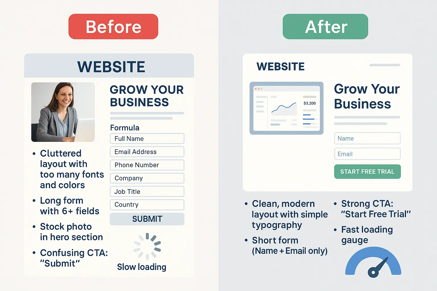
2. The Hero Section That Sells the First Glance
The hero section is the top part of your landing page. This is where visitors decide if they’ll keep scrolling or bounce.
Best practices:
- Use a bold headline + subheadline.
- Add a single, strong CTA button (“Start Free Trial”).
- Use an image or video that shows your product in action.
Example: Instead of stock photos, show a screenshot of your app or happy customers using your product.
3. Build Trust with Social Proof
People don’t just trust brands — they trust other people. Add:
- Customer reviews and ratings.
- Logos of companies you’ve worked with.
- Case study snippets or testimonials.
- Trust badges (SSL secure, money-back guarantee).
Action Tip: Place at least one trust element near your CTA to reduce hesitation. Check VK Interior
4. Smart Form Placement & Design
Forms are where you capture leads, but too many fields scare people away.
- Keep forms short (Name + Email is enough for most).
- Use clear labels and avoid jargon.
- Place forms above the fold or right after your offer.
Action Tip: If you need more fields (e.g., phone, company size), split them into progressive steps so it feels easier.
5. Optimise Loading Speed
Nothing kills conversions like a slow page. Research shows that a 1-second delay can drop conversions by 7%.
How to fix it:
- Compress images.
- Use a lightweight theme.
- Minimise scripts.
- Use caching.
Action Tip: Test your landing page with Google PageSpeed Insights and fix red flags.
6. CTA Placement That Converts
Your Call-To-Action (CTA) is the money button.
Best practices:
- Use action-oriented words (“Get My Free Guide” vs. “Submit”).
- Make it stand out with a contrasting color.
- Repeat CTA buttons in multiple spots (hero, middle, bottom).
Action Tip: Place a CTA after every value section so users don’t have to scroll back up.
Conclusion
A landing page isn’t just a design exercise — it’s a conversion machine. With clear headlines, a strong hero section, social proof, fast speed, smart forms, and strategic CTA placement, you can turn more clicks into customers. Don’t overcomplicate it: one page, one goal, one clear message. Start by reviewing your current landing page. Which of these best practices is missing? Fix that today, and you’ll see an instant boost in engagement and conversions.
Want to create a professional landing page without touching a single line of code? 👉 Read my guide: How to Make a Website Without Any Code and Make It Live. This step-by-step resource will help you launch your site quickly and start applying these best practices today.


No comments yet. Be the first to comment!